 stanford
 linkden
 github
 goodreads
 medium
 twitter
There have been several articles that re-order the medal count ranking by comparing medals to population or GDP, which then show small countries topping the charts. This analysis ignores some obvious facts: small countries are over-represented in the number of athletes they send and the relationship between athletes sent and medals is linear. I present a brief analysis to support and expand on these claims.

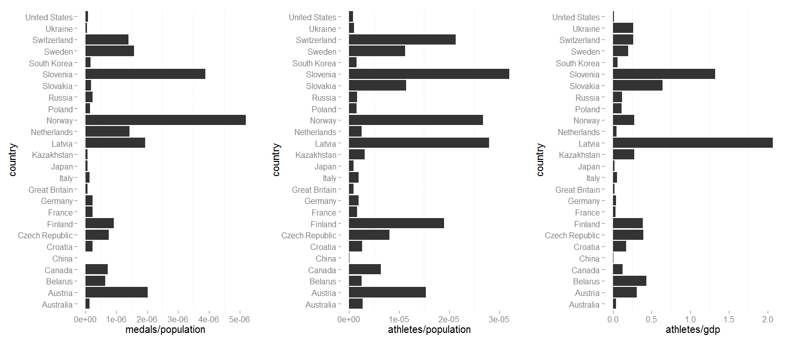
People often try to knock America and other large nations at the Olympics by changing up the medal chart to show medals per population or GDP (e.g. this Slate article). See the left panel of the below chart.
While these analysis often show small countries shooting to the top of the medal standings, they often ignore a glaring confound in the analysis: namely, each country can only send so many athletes to the Olympics regardless of their population, so there is an inherent bias toward small countries (Slovenia, Canada, etc.) that can send disproportionately more athletes per person than larger countries like the United State or China. For example, the middle and right panel of the below figure show the athletes per population and gdp ($billions). What is fairly obvious is that several small countries are massively over-represented (this way of showing it is slightly less intuitive, but visually easier to understand, than the inverse [population/athlete], which shows the same trend). This over-representation indicates that no matter if the USA or China won every medal they possibly could, they would never be able to reach the theoretical medals per capita that smaller countries obtain just by winning a few medals.
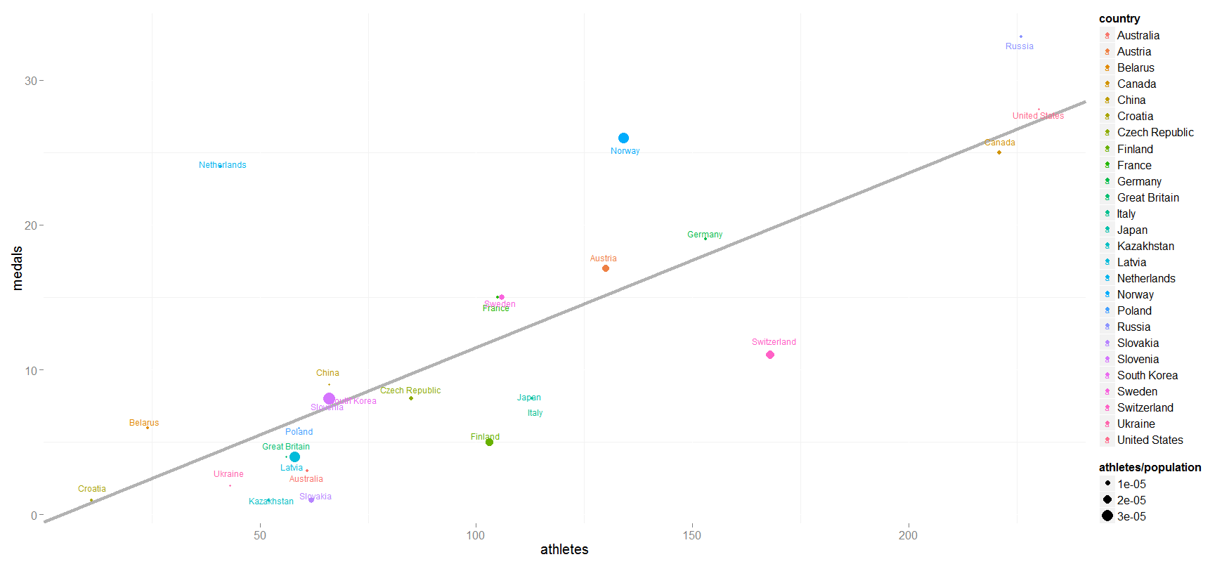
This leads me to the second graph, which shows the number of athletes sent to the games vs. the number of medals one. It is fairly linear relationship (R2 = 0.61, p-value = 2.22e-06, see best-fit line on plot below) that shows what one would expect: the more athletes sent, the more medals won. Significant positive/negative deviation from the relation indicates over/underachieving potential, e.g. the Netherlands is performing very well based on the number of athletes sent (mainly by dominating speed skating) while Switzerland is performing comparatively poorly. There is no obvious clustering of countries in the athlete v. medal chart of athletes per population (indicated below by the size of the point). Viewing the medal counts in this manner reduces the inherit biases when just looking at medals compared to GDP or population.
This should give a quick overview of one way to look at data in the news more closely (i may update the post with more detailed analysis in the future). Further, given the wealth of programming languages and automation in today's world, this should be the bare minimum for reporters. But then again, that wouldn't attract eyeballs.
note: I have excluded countries that have not won any medals (as of Feb 19th, 2014) from the analysis. Due to this, i have set population and gdp for those countries to zero in the provided csv file.
update 2014.03.08 The medal count (total including gold, silver, and bronze) has been updated to reflect the final tallies. Graphics have been updated accordingly. The code has also been updated to include best-fit line in scatter plot.
Below is the data used and script run to do the analysis.
analysis csv file
- # looks at data from the sochi games
- # biafra ahanonu
- # 2014.02.19
- # load data
- # create a theme function
- # ignore any countries with no medals
- sochiFiltered = sochi[!(sochi$medals==0),]
- # linear regression of athletes to medals
- # look at various statistics
- p1 = ggplot(sochiFiltered,aes(country,athletes/population))+geom_bar()+coord_flip()+ggTheme()
- p2 = ggplot(sochiFiltered,aes(country,athletes/gdp))+geom_bar()+coord_flip()+ggTheme()
- p3 = ggplot(sochiFiltered,aes(country,medals/population))+geom_bar()+coord_flip()+ggTheme()
- # compare athletes sent to medal count, jitter labels to allow better placement
- p4 = ggplot(sochiFiltered,aes(athletes,medals,label=country,color=country,size=athletes/population))+
- geom_abline(slope = fitSlope, intercept = fitIntercept, size=1.5, alpha = 0.3)+
- geom_text(position=position_jitter(h=1,w=1),size=3)+geom_point()+
- ggTheme()
![A�m�e�r�i�c�a�n� �E�a�g�l�e���10 October 2014 | designsDecided to continue playing around with Illustrator. Wanted to update the bald eagle with a USA flag wallpaper I have. Wanted something a l[...]ittle different and distinct, so went for the cel-shaded look. Maybe next time i'll get an eagle in flight...](../../design/?picture=american_eagle_cropped.jpg)